How To Create Your First iPhone App
This article really focused on the important, prerequisite steps for app development. It really reminds me of how we work in graphic design. Before you can have an awesome restaurant with red plates and mirrors everywhere, you need a concept.
The first step in designing an app is to realize your goal. This is not simply, "I want to make $1,000," but rather forces you to think beyond the scope of what you hope to make. You must think of all of the elements that your app will need, for example, someone to answer customer questions, someone to update the app, developers, etc. This is just a broad spectrum of the project for you, so you can have realistic expectations. Speaking of expectations, money is not promised. It depends on a variety of things, like production costs, popularity, and management.
As you might expect, another very important part of this process is to have your idea evaluated. You can and should have it evaluated by multiple sources, including marketing professionals, developers, and personal connections. Some things to question: does it solve a unique problem? Is it serving a niche crowd? Does it make people laugh? Are you improving on the wheel? Is it highly interactive? Knowing these things will help you put together your marketing plan.
Now that you have a better idea of what the app does, your goal, and what you need to keep it running, you can begin putting together a monetization and marketing plan. Thinking about how much you are willing and need to spend to get the app off the ground is very important. Next, you will have to sign up with an Apple Developer account for $99 annually. This ensures that your app goes under your name and brand. Now it's time for sketches. You don't need to have perfect sketches in order to get your idea across, but the more clear they are to other people, the better chances you will have with working with a developer and getting things right in the early stages. At least one sketch per page is necessary. The next step is to identify your outsourcing needs. This usually covers a designer, developer, and promotion and marketing person. Find out what you need specifically, and then find those people to work with and hire them.
I felt like this was a really interesting article because I never really thought that this much insight and background went into app design. If these steps help an app become successful, I can only imagine how many apps have been left on the chopping block. Some apps still make it, and I hardly believe they were approved (I have a knock on wood app- it's just a vector art screen that looks like wood that does nothing).
iPhone App Icon Design: Best Practices
This article focuses entirely on creating a successful app icon. This is imperative to understand, as you have a 57x57 pixel square to work with. To find great looking icons, I would suggest looking at the top downloads from the app store. You will find items like facebook, instagram, and google. I have found that the most unsuccessful app icons usually are for games; they are unsuccessful because they are doing the age-old ten pounds of shit in a five pound bag.
How can you avoid having a bad app icon? Keep these things in mind: don't use words, keep it simple, don't use Apple's standard gloss feature, consistency is key, and stand out! This might sound like a huge laundry list, but really there are great reasons for this.
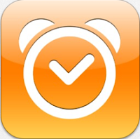
Words tend to get pixelated, or are so small that they are rendered unreadable. Overcomplicated app designs also make it hard to understand what the point is. This is not always applicable to game apps, because if someone knows it is a game app, it probably doesn't need to get the "what does this do" idea across. Usually game apps use a character. Apple's gloss feature can change the readability of an app, but the purpose to is create a consistency in the look of multiple apps on a device. Since it is not necessary, it almost seems silly to add it if it may hinder your design. Below I've grabbed some examples from the app store to look at.
 |
| app as viewed in app store. |
 |
| app as viewed icon size. |
 |
| simple, clean, easy to understand app. |
 |
| the app glare makes this app harder to see. |
 |
| simple icon. |
 |
| interesting icon. |
ADDITIONAL RESOURCES
Apple App Guidelines
40 Inspiring App Icons
What Do Top App Icons Have In Common?
App Design Templates
How To Make A Top Selling App With Great Design
App Design Trends
No comments:
Post a Comment