9.20.2012
bathtub gin & co identity system
 |
| new 2 color logo |
 |
| letterhead, envelope, business card. |
 |
| full system, letterhead, envelope, business card, and style guidelines. |
 |
| style guidelines. |
bathtub gin & co creative brief
Client Brief
2205 2nd Ave.
Seattle, WA 98121
206.728.6069
bathtubginseattle.com
What do we do: Modern-day Speakeasy style Bar. Stock a wide selection of rare and local spirits. Hand crafted cocktails. Limited food menu.
When did we begin: Owners Jessica and Marcus started BG&Co July 25, 2009.
Who works here: Small, personal staff includes 4 bartenders and 4 cocktail waitresses. Family-like atmosphere.
Who comes here: 26-31 year old young adults who enjoy the intimate, speakeasy scene of the past. 31-50 year old patrons looking for specialty, hand-crafted cocktails and exotic spirits.
Us in One Sentence: Intimate, modern-day speakeasy with a knack for mind-blowing hand-crafted cocktails.
 |
| current logo and webpage |
The current logo for Bathtub Gin & Co is very beautiful, actually. I love the use of shape for the text, because it is very 1920s-esque. There is a bathtub shape in the middle of the logo, and the floral/ornate decor is reminiscent of a bathtub brand label. The colors are an alright scheme to suit the business, but I feel like there could be better. The business card uses a script type as the secondary type for their information.
Why do I want to change it? I feel like this logo leans on the edge of “girly” and I feel like their brand would be better suited with one that is less swirly and “pretty”that utilizes strong 1920s style type and shapes. I also am concerned about scalability with this logo, as it needs to be very large to be readable. I would like to change the color scheme as well to convey more of a rich, secretive feel. I would like to use the bathtub icon as a separate piece that can become a pull-away.


7.10.2012
twif beard & stache fest creative brief
The World Is Fun Advertisement Creative Brief
Job: Beard & Stache Fest 2012 Ads
Date: 05.10.12
Date: 05.10.12
Client: The World Is Fun Non-profit
Page: 1
Page: 1
Types: 5 Black/White Newspaper Ads
Project Description (What is it?)
Design a set of black and white newspaper ads for a non-profit organization. The ads need to relate to one another and appear as a series that is consistent and recognizable. Up to 5 ads may be designed as well as possible collateral.
Target Audience (Who are we talking to?)
Primary: 18-40 year olds interested in volunteering.
Secondary: Men with facial hair willing to volunteer.
Purpose (What must it accomplish?)
The advertisements much generate interest in the event, as well as the non-profit group, The World Is Fun. The series should attract attention and provide an enticing, and easy call-to-action that people don’t negate because it’s volunteer work. It should also appeal to those who feel like they cannot donate financially, so they can offer to donate their time.
Style & Tone (What do we want them to think?)
The ads will be printed in black and white, but need to be fun and exciting. They should make the viewer excited to look into more info about the event, and in turn, attend. Body should be concise and minimized as to not draw attention from the ad focus point.
Benefits (What benefits does the company offer? What makes us unique?)
The World Is Fun is a Seattle non-profit group that runs fun, social events that don’t seem like volunteer work. From the Beard & Stache Fest, to cook-offs, to bicycle maintenance parties, TWIF offers a variety of events that are less like work, and more like fun.
"We are The World is Fun! You can call us TWIF. Our mission is to be the catalyst to connect volunteers, corporations and charities in need and we are here to do things a little differently. TWIF is 100% volunteer run. We support Seattle by connecting volunteers, local businesses, and Seattle nonprofits to create a mutually beneficial community for everyone involved. In other words – we can’t do this without your help! There are about a million ways to help TWIF - from volunteering to donating to simply tweeting – but we don’t have room to list all one million, so here are a few. (When you come up with one of the 999,980 ways to help that isn’t on this page – contact us! We’re always open to new and creative ways to get involved with our community!)"
6.06.2012
photorealistic illustration final
my first ever unfinished assignment. i went a bit of the wrong direction with painting the house.
PROCESS
PROCESS

6.05.2012


5.22.2012
5.21.2012
infographic final
interactive taco pdf
to see functioning pdf: right click this link and save as to a location of your choice. open the file with adobe acrobat and enjoy playing!
also, credit to jenn chaput for hand making my exclamation marks to match the awful typeface i chose.
to see functioning pdf: right click this link and save as to a location of your choice. open the file with adobe acrobat and enjoy playing!
also, credit to jenn chaput for hand making my exclamation marks to match the awful typeface i chose.
5.15.2012
infographic sketches
alright, so after doing the wrong sort of research, i decided to go with my idea for a taco infographic.
my client is the tin hat in ballard, and the subject will be the anatomy of a taco. it will be ad advertisement for their 69cent taco tuesday special.
here are some sketches i made as far as layout and chart style. i know (now) that they are a bit too ambitious for this project. the decided on infographic will be a image of a taco that has click buttons that pop up a window with (hopefully) a sketch and title for each ingredient in the taco.


5.08.2012
infographic research
Working Women
Misspellings
Makeup
Body Type
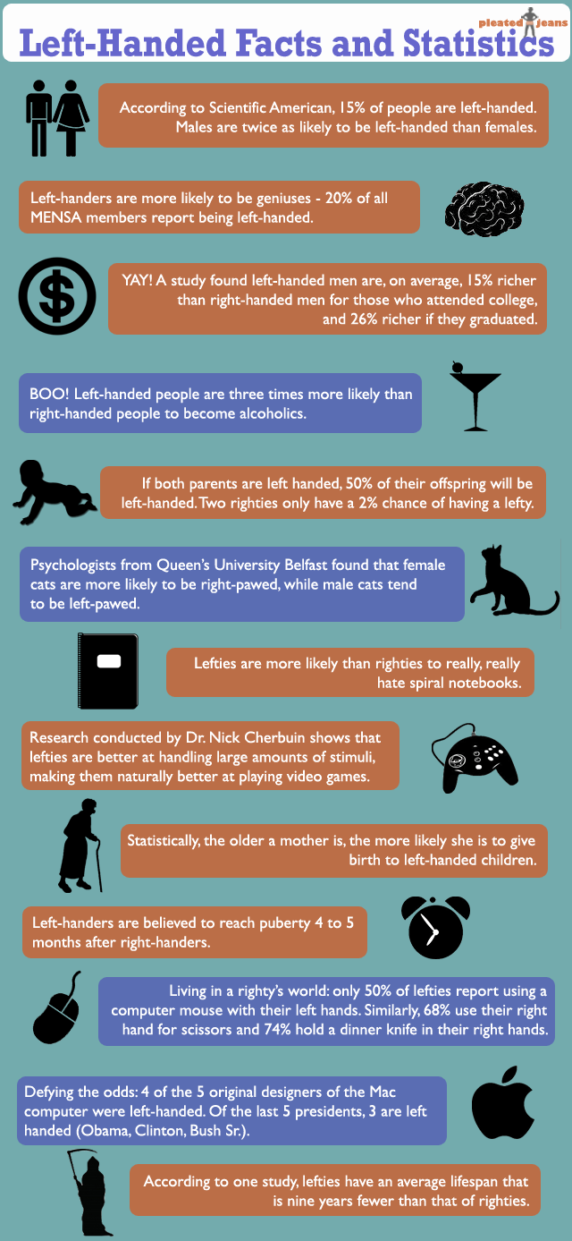
Lefties
Taco Bell
Cat Smells
Tacos
These are my choices for infographics. The final choice, I would like to change a bit to be more of a how to make tacos appraoch.
Misspellings
Makeup
Body Type
Lefties
Taco Bell
Cat Smells
Tacos
These are my choices for infographics. The final choice, I would like to change a bit to be more of a how to make tacos appraoch.
5.05.2012
5.04.2012

4.17.2012
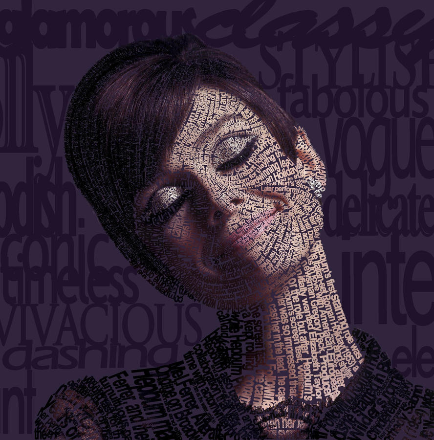
type portrait statement
1. Background
Typographic illustration to be used as promotional artwork, event poster, or single release for singer Lana Del Rey.
2. Target Audiences
From tweens to mid-thirties. Target audience is the same as that of her branch of music.
3. Objectives
Create interest in the piece while still reading as a photo of Lana Del Rey. The illustration will only use typography to create the image. When it is complete it will draw attention to the event/single that it advertises.
4. Obstacles
The largest obstacle in this project is the ensure the photo actually resembles the artist.
5. Key Benefit
The viewer’s attention will be grabbed by the interesting take on the image, which will then lead them to the event/single information.
6. Support Statements/ Reasons Why
Lana Del Rey is an emerging artist who just released her debut album. To generate sales for the album, it is important to have promotional items as well as events where the artist attends and reaches her audience. This illustration will help to create interest and increase the target audience.
7. Tone
The illustration needs to be recognizable to the target audience, but should set a somber mood that matches the original image.
8. Media
The illustration could be printed on promotional pieces such as posters, bags, tshirts, etc as well as event posters/flyers and cd artwork.
type portrait photo options
i have yet to decide which style of typographic portrait i'd like to do, but i have a few photos that i think would be fitting for the project.
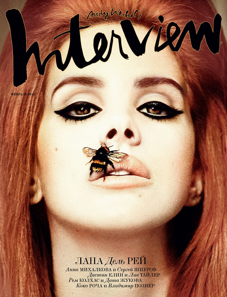
lana del rey-
i would use one of her portraits for an album cover or possible poster for an event.


lana del rey-
i would use one of her portraits for an album cover or possible poster for an event.
(credit to be give to interview magazine)
(credit to be given to interview magazine)
(credit to be give to complex magazine)
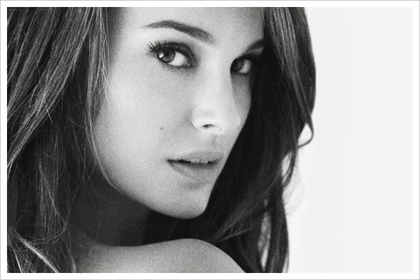
natalie portman-
i could use her portrait as an opening image for a magazine article. it might possibly be an article about her future projects or charitable work.
(miss dior cherie photographer)
(miss dior cherie photographer)
(david slijper)
(raymond meier)
type portrait inspiration
here are some links to type portraits that i like:
this first set shows typography used to create outlines and shadows of faces. i like the fact that the words do not obviously mean something to the portrait. i like the idea of just working with the shapes of the letterforms to get a desired curve or angle.
shades
swirls
nnn
these links show the use of typography and specific words that are somehow related to the subject. they also utilize the typography in the entire space, not just working with shadows.
marley
angelina
audrey
rihanna (reverts to outlining, but works with changing typefaces)
4.16.2012

4.15.2012
4.10.2012
editorial illustration comp sketches


further, the idea is to work with an angry twitter bird who we assume has been drinking and tweeting.
editorial illustration rough sketches


the idea thus far is to use a blue bird symbol (see twitter logo) in a way that emphasizes thinking before you tweet.
4.03.2012
editorial illustration inspiration research
i've decided to run with the think before you tweet article. i think it will be easy to convey as well as fun and symbolic!
kanye tweet insanity
ad
#wtf
heart break
140 characters or less
rant!
dead bird
with stupid
roasting bird
win:
far enough
kanye tweet insanity
ad
#wtf
heart break
140 characters or less
rant!
lose:
think before you tweet
dead bird
with stupid
roasting bird
editorial illustration concept research
first option: stop and frisk
second option: compact garbage collection
third option: Facebook password demands are out of bounds
fourth option: still not a woman's world
fifth option: think before you tweet
alright, i'm aware that you only required three options, but i wanted to have a few extra!
second option: compact garbage collection
third option: Facebook password demands are out of bounds
fourth option: still not a woman's world
fifth option: think before you tweet
alright, i'm aware that you only required three options, but i wanted to have a few extra!
a glimpse of the past
 |
| brooke and jenn venus it up. |
 |
| art deco magazine cover. |
 |
| original cover. |
 |
| brooke and jenn collect scary renaissance babies. |
 |
| typography/heirarchy. |
 |
| live model charcoal. |
 |
| live model gouache/watercolor crayons. |
 |
| charcoal fairytale. |
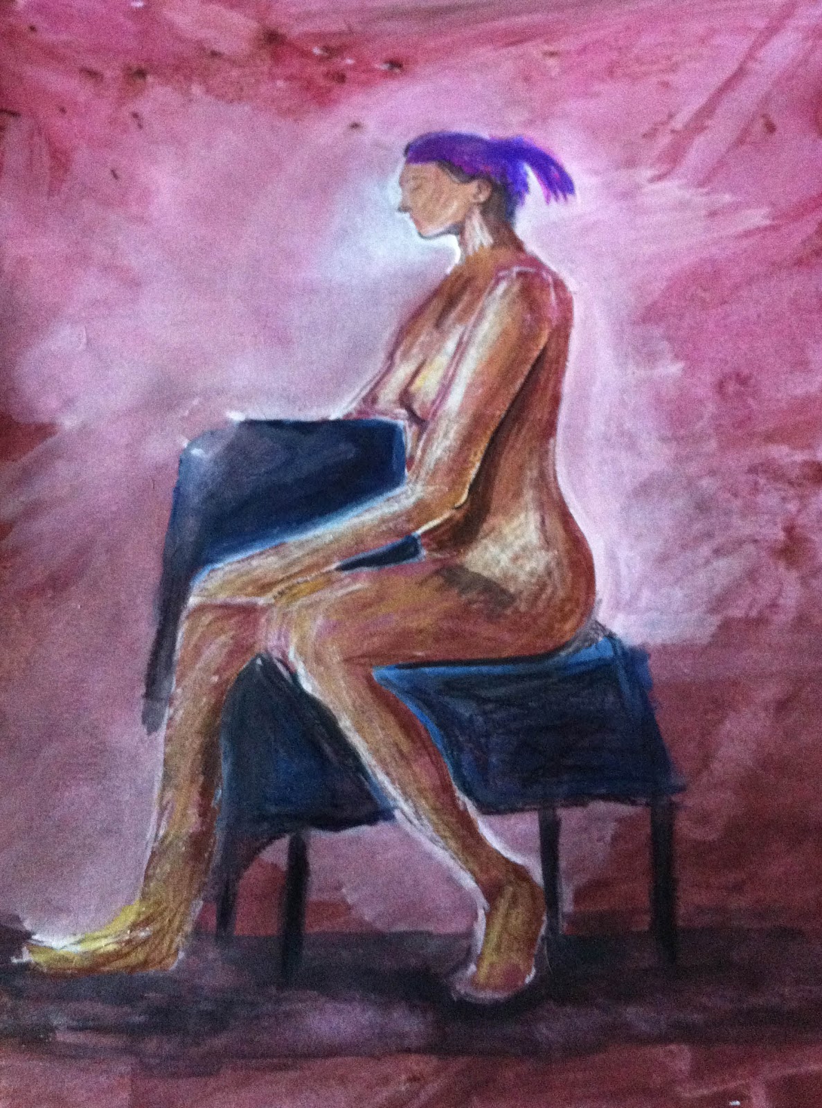 |
| live model with gouache/watercolor crayons. |
Subscribe to:
Posts (Atom)